Our Canoe Bathroom Renovations
This blog post is all about our Canoe bathroom renovations- how we decided on the overall style and colours, why we chose some of the things that we did, as well as what the bathrooms looked like before. I think you’ll be able to see how we brought the homeowners’ vision to life in the before & after photos. We also thought you may enjoy seeing how our design presentation translated into reality, so I’ve featured those images in this blog as well!
These gorgeous bathrooms showcase a ton of custom features. These clients had a really good idea of what they wanted, so we took their style and brought it from builder-basic to completely custom and all their own! Here at Marianne Elizabeth Design, we prioritize creating spaces that reflect the design style of our clients rather than our own personal style. This means that each and every space is unique, and perfectly catered to that client’s needs and wants.
THE ENSUITE BATHROOM
In their ensuite below, our clients really wanted a gold & navy bathroom that was elegant and inviting. While a gold and navy colour scheme is beautiful and classic, it is a very popular trend, so we wanted to really elevate that design concept to make it more special for them. By adding a blue and white marble-y tile in the shower, as well as wood elements like the doors and mirror, we were able to give them a design that was perfectly custom! These wood elements brought a lot of warmth and texture to the space. In the shower, the navy hexagon band brought that navy colour around the room, as well as provided the perfect backdrop for those gold fixtures to pop!
Here is what our design presentation looked like for the ensuite:
And here are the before & after images:
THE MAIN BATHROOM
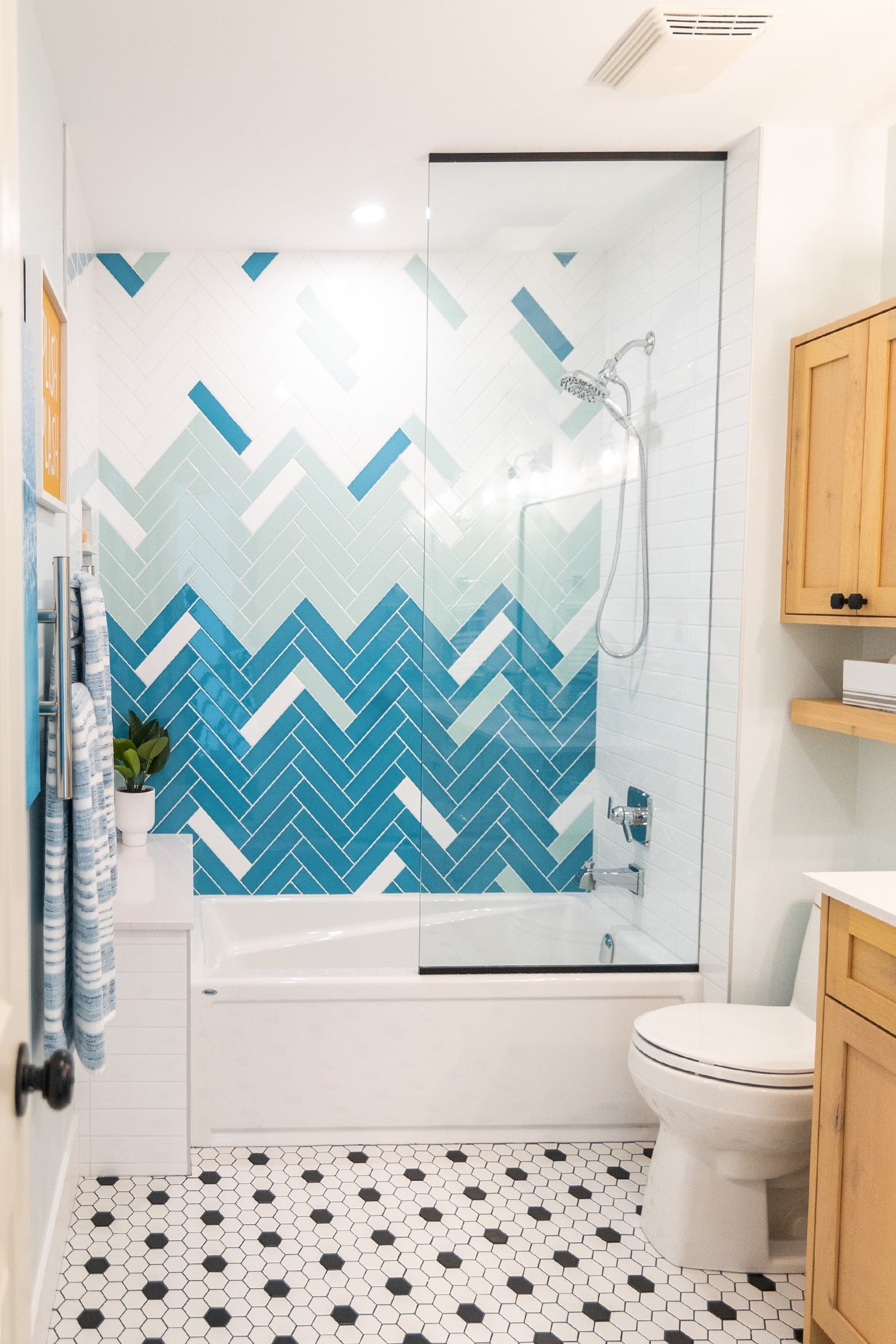
For the main bathroom in this house, they also had a good idea of what they wanted. They love turquoise and wanted to feature that vibrant colour in the bathroom. They also knew that they wanted a black and white floor, and have a bathroom with a bit of a beachy-feel. Of course we didn’t want it to be beach-themed as that can become cheesy and dated, but we wanted it to be beach-INSPIRED. We were able to select shimmering square turquoise tiles that they absolutely loved, as well as create a herringbone ombre feature wall, in green and blue. These elements added the pops of colour that they wanted without being over-the-top. The white-washed look of the knotty alder vanity was a gorgeous contrast to the cool colours in the room, and also helped lean into a beachy vibe.
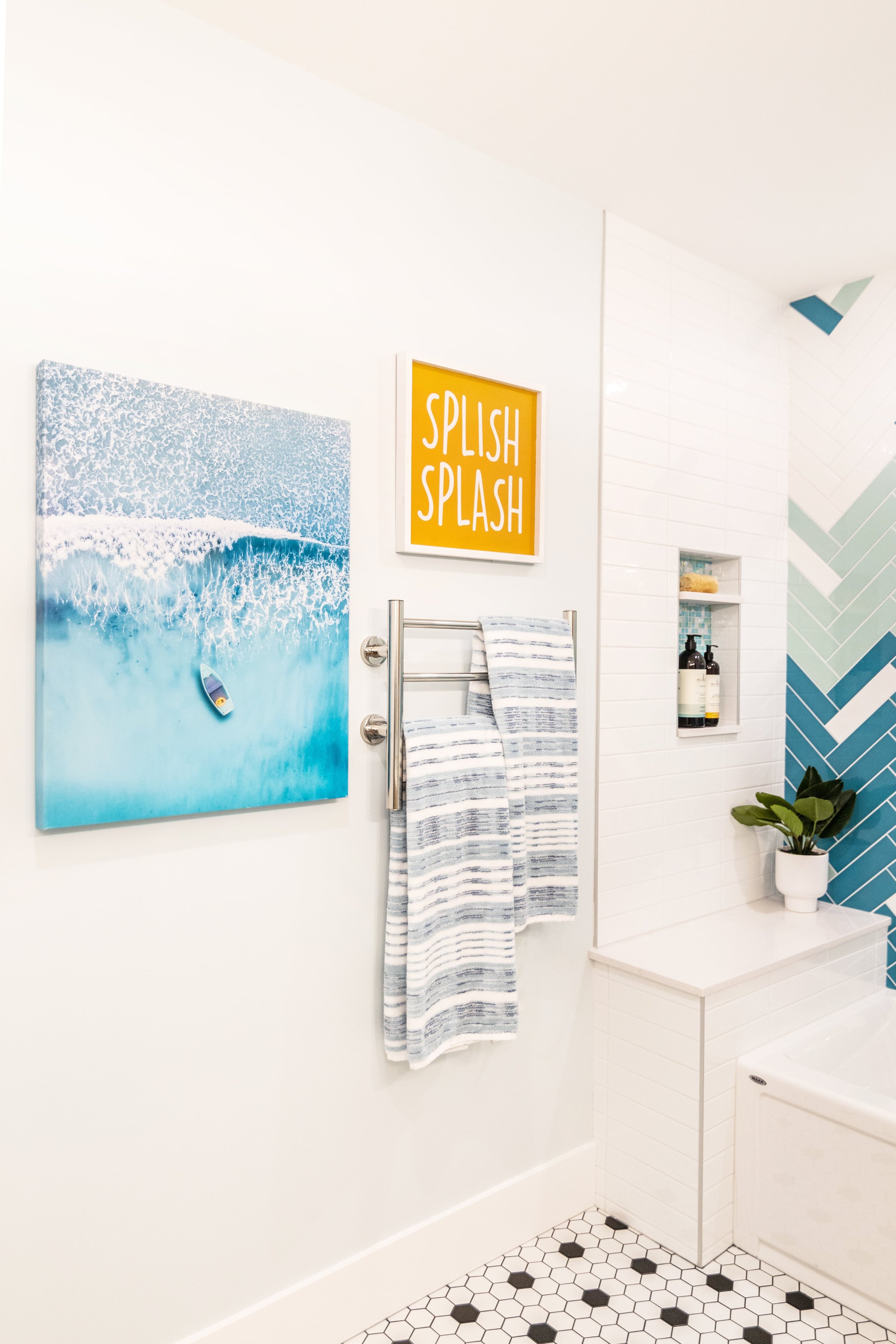
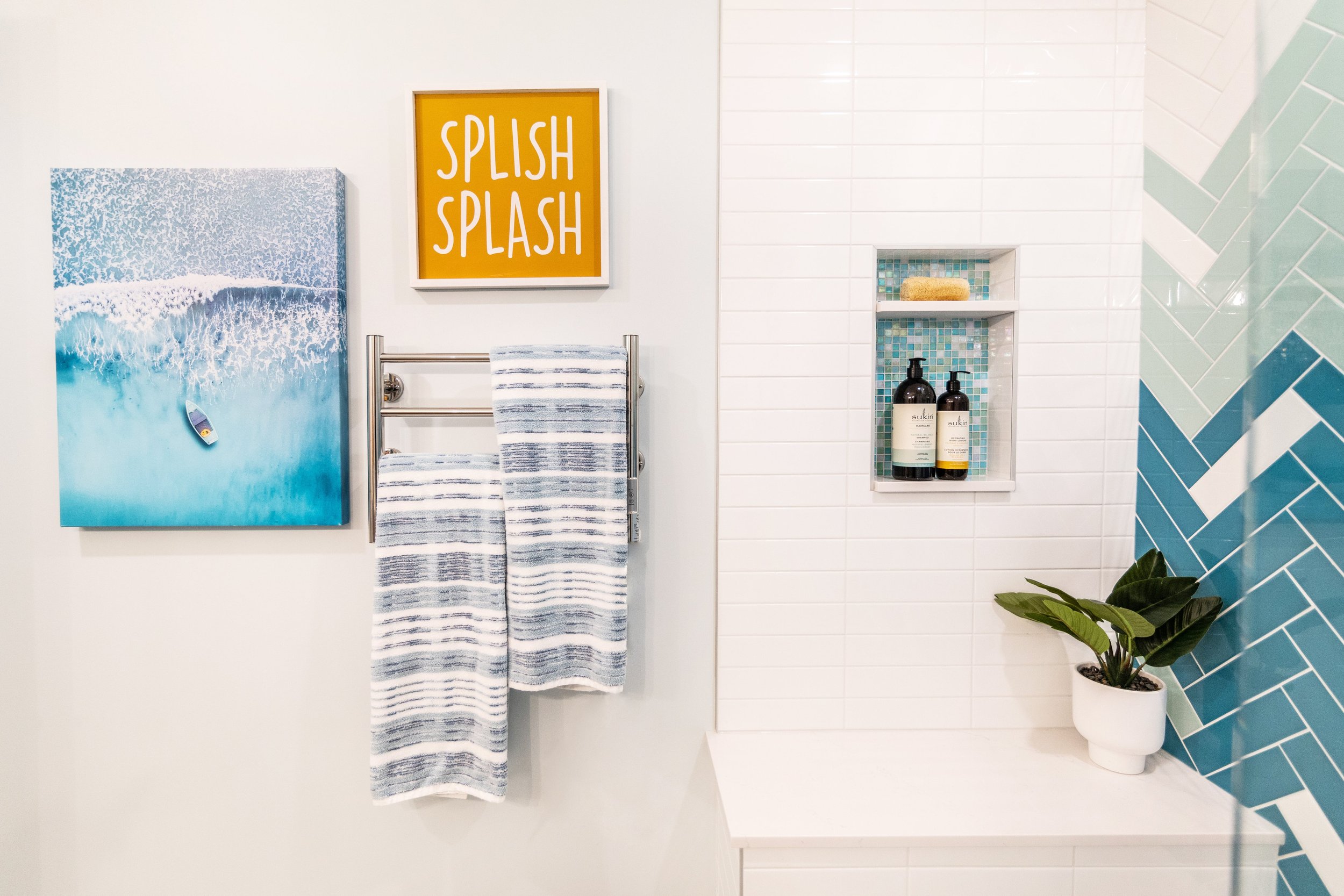
While this bathroom was smaller compared to the ensuite, we were still able to add some unique features! The over-sized tub area allowed us to create a “bench” at the end of the bathtub, which became a perfect spot for placing extra shampoo bottles. They wanted to make sure there was plenty of storage space so we added a cabinet above the toilet that matched the vanity. And these lucky kids also got to have heated towel bars! To make sure the towel bar was visually appealing with the layout and décor, we hung the artwork around it in a collage-like fashion, which made it feel very purposeful and visually appealing. We love how this turned out!
But the showstopper for this bathroom was probably the tile! We were able to showcase four different tile styles/colours in a small space and it works perfectly! The tile includes a black & white small hexagon, a turquoise square accent tile, three colours of subway tile laid in a herringbone pattern, as well as a straight-stacked white subway tile.
Here is what our design presentation looked like for the main bath:
And here is the before & after for the main bath:
I hope you enjoyed reading about the designs of these bathrooms. It is our pleasure to bring our clients’ visions to life! If you’d like to see more before & after transformations from more of our projects, you can view that album here.


